Mapping New York City Uber Pickups
Designed by: Michael Spencer
Overview
FiveThirtyEight is one of the few organizations to have acquired valuable trip data from a ride-sharing service like Uber. This trip data includes the trip dates, and pickup locations in the form of latitudes and longitudes. Drawing inspiration from similar projects and as someone who enjoys great data visualizations, I wanted to map these pickup locations to see what I could create.
The Data
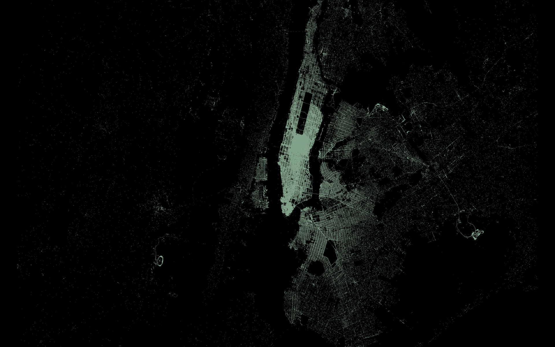
As mentioned, this data is available via FiveThirtyEight's GitHub. The data includes Uber trips from April - September of 2014 and also trips from January - June of 2015 in and around the NYC metro area. For each trip, the data includes the exact latitude and longitude location of the trip origin - whether on a sidewalk or in a park - and the time that the trip occurred. By plotting just these pickup locations, it's possible to create a detailed map of the tangled NYC streets due to the number of recorded trips - well over four million.
The Process
The visualization you see was created using R and RStudio, two great tools for data science and ad-hoc visualizations. For this project, I used the base graphing packages ggplot2 and sf. Though you might assume the data could be loaded in and plotted immediately, it actually required a bit of transforming to get it into shape. The NYC metro area is fairly large, and like all good maps, properly visualizing it requires a cartographic projection. In order to ensure the geographic accuracy of the plotted points, I altered the given latitudes and longitudes using the USA Contiguous Albers Equal Area Conic projection, a standard projection for making maps. Projections such as these are the reason some maps show continents bigger than others and why some maps show the USA-Canada border as flat rather than curved, among other things. They're as much a tool for artistic expression as anything else, but they're nevertheless important to get right.
Once the pickup locations were accurately defined, making the map above was as easy as dropping pins on a blank sheet of paper; in this case, however, there were over four million pins. Plotting them was done using ggplot and simple plotting commands. You can find the actual code used on my GitHub.
Discussion
Though more analysis is to come, from the single map above we can see a clustering of points in the Midtown area. This is likely due to the swarms of visitors - tourists and commuters alike - that invade the city during the day. Attractions such as Broadway and Times Square, as well as business, retail, and service jobs bring together people from the entire metro area. Notably, the Midtown area seems to be the center of this mass. Looking further away towards the outer boroughs of Brooklyn, Queens, and northern Manhattan, we see that ride density drops. This could be due to a lack of tourists or busy commuters, but it's hard to say without further analysis.
Interestingly, this map also allows us to see the three large airports serving the NYC metro area: LaGuardia, JFK, and Newark. Each of these are located outside of Manhattan and thus, with a little searching, are easily identifiable. Notably, enough points were plotted that you can identify the individual terminals at each airport, particularly JFK.
Further questions about this data might ask what time of day most rides are requested and how that varies by area. I look forward to continuing this project and bringing you more insights. Have questions or thoughts? Please reach out.